Font
If text is the vehicle for the transmission of information, then the visual characteristics of the text itself—that is, the font—influence the quality of the message.
In principle, the typesetting of a resume should be concise and clear. As for font, first you should never use fonts that are too fancy, second the types of fonts should not be too many—best limited in three. Here we will discuss some basics of fonts and main points in typesetting.
Font classification
Serif vs. sans-serif
In terms of serifs, fonts for Latin alphabet are divided into two families: serif and sans-serif1.
A serif is a tiny line attached to the end of a stroke in a letter. A font with serifs is called serif font, or serifed font. In contrast, a font without serifs is called sans-serif font, where sans is the French word for "without".


Proportional vs. monospaced
According to whether or not the widths of letters are the same, fonts can be divided into monospaced and proportional. As the name suggests, all letters in a monospaced font occupy the same amount of horizontal space, while in a proportional font they don't.

In traditional printing, proportional fonts can improve the legibility of words. Due to technical limitations, the early computers and typewriters can not adjust the widths of letters . So all characters are made into the same width, thus monospaced fonts come into being. With the improvement of computer technology, the GUI (Graphical User Interface) has become the mainstream and been developing continuously, technical limitations no longer exist, so proportional fonts have become quite popular, since they are more naturally legible for human.
CJK Font
Font styles in CJK (opens in a new tab) is a bit complicated. Generally speaking, there're also serif and sans-serif fonts in CJK languages.
Song
Song (opens in a new tab): known as 宋体/明体 in Simplified Chinese, 宋體/明體 in Traditional Chinese, みんちょうたい/明朝体 in Japanese, 명조체/明朝體 in Korean, is the serif font in CJK.
Song is usually used for body text, headings and notes. When used for headings, the weight of the characters is often increased to differentiate them from the body text. Currently it is the most common used font in printing.
Bold
Bold (opens in a new tab), known as 黑体 in Simplified Chinese, 黑體 in Traditional Chinese, is the sans-serif font in CJK.
Bold is often used for headlines, introductions, logos, etc. Bold is also used in body text to emphasize specific words. Due to the large number of strokes in Chinese characters and the poor clarity of bold in small characters, traditional printing rarely uses bold as the body text; however, with the refinement of character creation technology, coupled with the development of the Internet and digital publishing, many bold fonts have been developed for body text, and a small number of books have begun to use bold as the body text font.
Besides Song and Bold, Chinese also has two additional font styles that are widely used.
Regular
Regular (opens in a new tab): known as 楷体 in Simplified Chinese, 楷體 in Traditional Chinese, is the most common style used in modern Chinese writings.
Regular are mainly used for headings, introductions, dialogues, summaries and other paragraphs that are different from the main text. However, regular are less frequently used for emphasis because of their proximity to Song.
Fangsong
Fangsong (opens in a new tab), known as 仿宋体 in Simplified Chinese, 仿宋體 in Traditional Chinese, is a type of regular script typeface. It is mostly used in the introduction, summary and other paragraphs that are different from the main text. Meanwhile, it is also the standard font used in official documents produced by the Chinese government.
Font design and usage
Digital publishing has been developing for many years, and western lanauges has a very small character set, so there are many kinds of fonts designed by different people with various demands.
For a monospaced font, the main focus is on the design of each single letter, other than that, in a proportional font, the space between letters should also be seriously considered.
Letter composition
Letters in every font have a consistent structure, font users are supposed to know these basic concepts:
- baseline: the invisible line on which "H" or "n" stands
- cap height: the distance from baseline to the top of a linear uppercase letter like "H" or "E"
- x-height: the distance from the bottom to the top of lowercase "x"
- ascender: the ascending parts of lowercase letters like "b", "d", "f", "h", "k", "l" over the top of "x" , its height is called the ascender height, the top line which ascenders align is called the ascender line
- descender: the descending parts of lowercase letters like "g", "j", "p", "q", "y" below the baseline, its height is called the descender height, the bottom line which descenders align is called the descender line

Letter-spacing
Letter-spacing, or tracking, refers to the space between letters. Letter-spacing adjustment is divided into font designers' side and font users' side; it affects the density in a line or block of text.
For font designers, the adjustment of letter-spacing is an important procedure in designing. In a proportional font, the spacing on the left side of a single letter is not necessarily the same as on the right side. The purpose is to ensure legibility when the letter is next to whatever other letters on both sides.
For font users, the adjustment of letter-spacing means manually rearranging the space between letters by software after the original typesetting, in order to obtain special alignment2, or a better layout effect3.
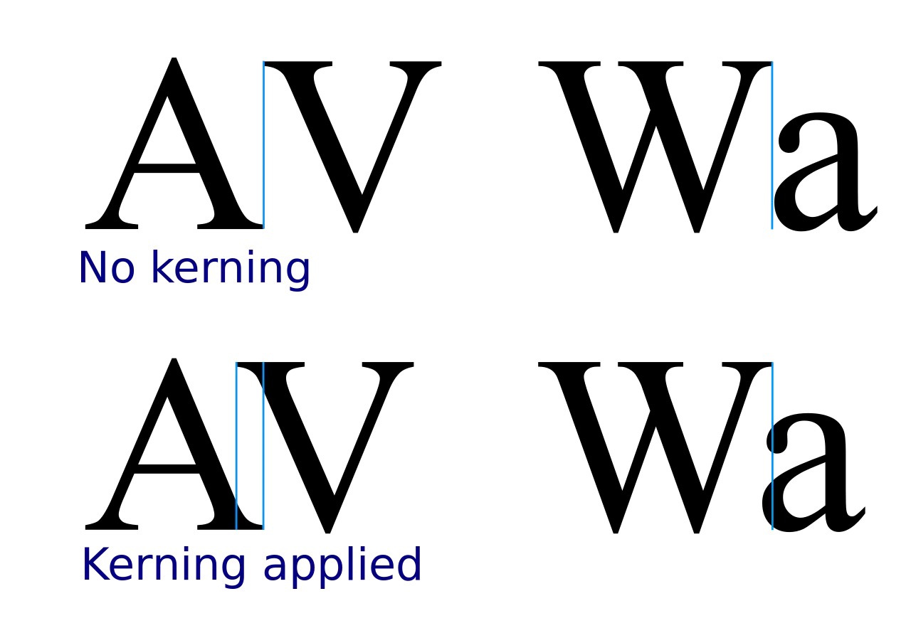
Kerning
Kerning refers to the process of increasing or decreasing the space between specific letter pairs in a proportional font. These pairs of letters are called kerning pairs. Kerning is more concerned about the visual spacing rather than the actual spacing.
Designers of many fonts will pay attention to kerning pairs while designing, and store kerning adjustment values in the font file. In this way, typesetting software can automatically adjust spacing for kerning pairs according to the values, thus produce a better layout effect.
Every letter has a unique shape, so during the design and implementation of a font, letters in all kerning pairs must cooperate to produce the best visual effect. In fact, this is where the key procedure and difficulties lie4.
Ligature
A ligature is a glyph that joins two or more letters together.
Ligatures in print originate from hyphenated characters in handwriting. After the birth of movable-type printing, many ligatures were directly made into type. However, after the widespread use of sans-serif fonts in the 1950s and phototypesetting in the 1970s, the use of block letters became rare. The earliest digital typesetting software that could use ligatures for digital typesetting is TeX created by Donald Knuth (opens in a new tab). This trend also affected the desktop publishing after 1985. In early times, software could not replace letters with ligatures (but TeX could), and most of the newly made fonts for computers did not include ligatures. Furthermore, in the early days of personal computers, most of the computers were in English, and there was no practical need for the use of ligature, as it was not mandatory to use it in the English language. With the development of digital typesetting technology such as OpenType (opens in a new tab), ligatures have gradually returned to practice5.
In normal day-to-day business documents, the lack of ligatures is not treated as spelling error, but for professional typesetting in advertising, book publishing and other fields, ligatures are essentially required.

Italics
Italic is a font style achieved by tilting the font on top of the normal font style; it can refer to italic type or oblique type6.
There are two types of tilted fonts in western font: oblique type and italic type. The one that is tilted with a change in the shape of the characters is "Italic Type", while the one that simply tilts the original font to the right without a change in the shape of the characters is known as oblique type. Since oblique italics, which are simply tilted and distorted by software algorithms, have loose strokes, more and more designs have recently favored the use of newly designed, specialized italic types.
Theoretically, italics include italic type and oblique type, but it should be noticed that actually not all italic type are slanted .
In practice, italics are usually applied to one piece of text to emphasize or distinguish it from the main body that is in serif fonts.
Old style numbers
Old style numbers, also known as text figures (opens in a new tab), designed with varying heights for latin script languages in a fashion that resembles a typical line of running text, hence the name.
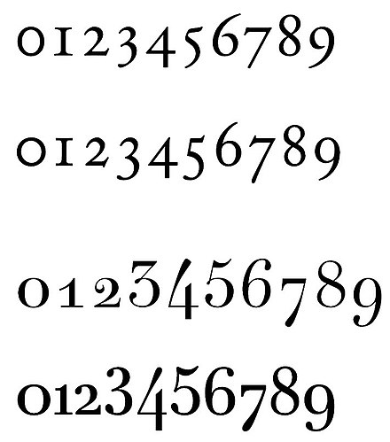
In contrast, lining style numbers (also called lining, titling or modern figures), have the same height as upper-case characters.
PPResume defaults to old style numbers for latin script language resumes and lining style numbers for others.
High-quality typesetting generally prefers text figures in body text: they integrate better with lowercase letters and small capitals, unlike runs of lining figures. Lining figures are called for in all-capitals settings (hence the alternative name titling figures), and may work better in tables and spreadsheets.
Recommended Western Font
There are tons of fonts out there nowadays, so recommending a universal western font scheme for your resume is not an easy task.
- RECOMMEND, using serif fonts for the main body text
- RECOMMEND, using sans-serif fonts for titles, but serif fonts can be used as well
- RECOMMEND, using italic font style to emphasize text in main body, corresponding bold style can be used as well
Here is a list of commonly used serif fonts:
- Garamond (opens in a new tab)
- Palatino (opens in a new tab)
- Geogria (opens in a new tab)
- Baskerville (opens in a new tab)
- Minion (opens in a new tab)
- Hoefler Text (opens in a new tab)
- Linux Libertine (opens in a new tab)
A list of commonly used sans-serif fonts:
Footnotes
-
When the width of layout is small, usually it's not suitable to use justified alignment, because applying justified alignment will force most software to adjust the letter-spacing, and often, the final layout effect will be very bad. ↩
-
For example, the innovation of TeX typesetting system lies in its excellent justification (opens in a new tab) algorithm, the principle of which is to adjust the letter-spacing to make the layout more justified (opens in a new tab). ↩
-
A Beginner's Guide (opens in a new tab) to Kerning Like a Designer ↩